Background Information:
- Location: Beswick, Manchester
- Style of property: Commercial AirBnB
- Designer: Avalana
Client Overview
Property guru, Mirko Didara, wanted to make over one of his properties for rental with a clear aim of creating an extravagant place to stay. He visualised a nature-inspired luxury interior to contrast against the urban exterior. He called on the expertise of Manchester designer, Avalana Simpson to bring the scheme to life.
Why Avalana Design?
In Mirko’s words: “My rental portfolio is expanding and I noticed a real gap in the market for exceptional looking and opulent homes close to Manchester. People want to be in this amazing city or be with easy access but without spending on expensive hotels. It’s all about curating the unforgettable staycation and experience and to appeal to people looking for something exceptional. The property has to make you stop in your tracks on sites such as AirBnB. I had seen Avalana Design online on and I instantly wanted to appoint her interior design skills to deck out a bland looking property with her unique style.”
The brief was quite simple. Create a luxurious, boutique interior with the Avalana Design aesthetic throughout.
The Design Scheme:
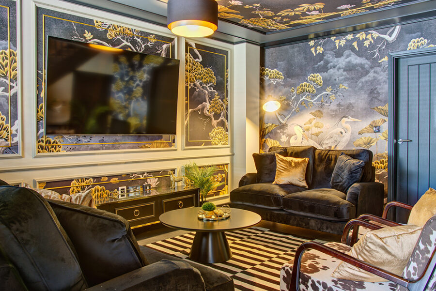
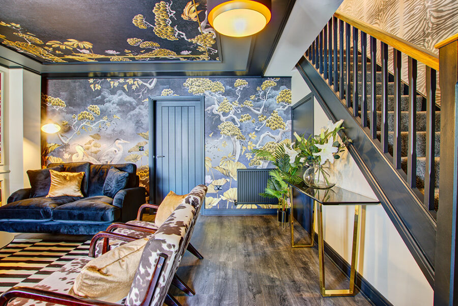
Designer, Avalana Simpson, designed the full interior including entrance hall, downstairs WC, lounge, open plan dining / kitchen, staircase and landing, main bathroom, three bedrooms and an en-suite.
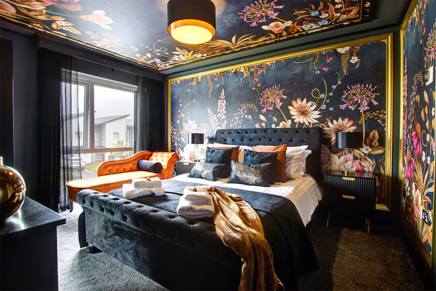
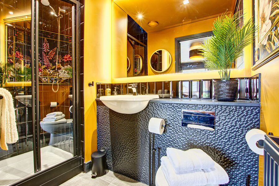
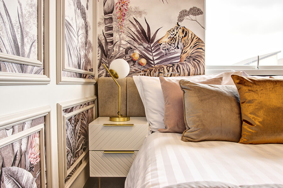
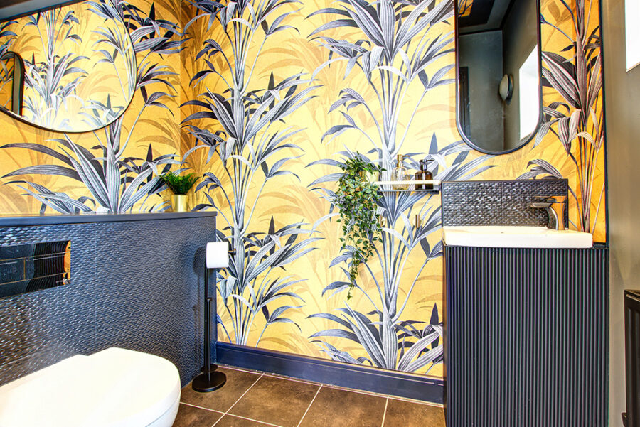
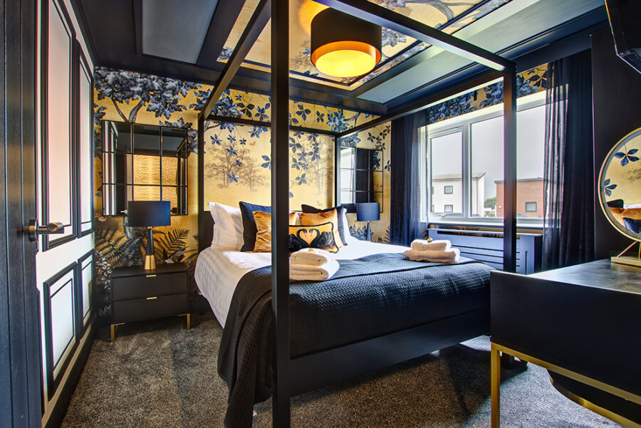
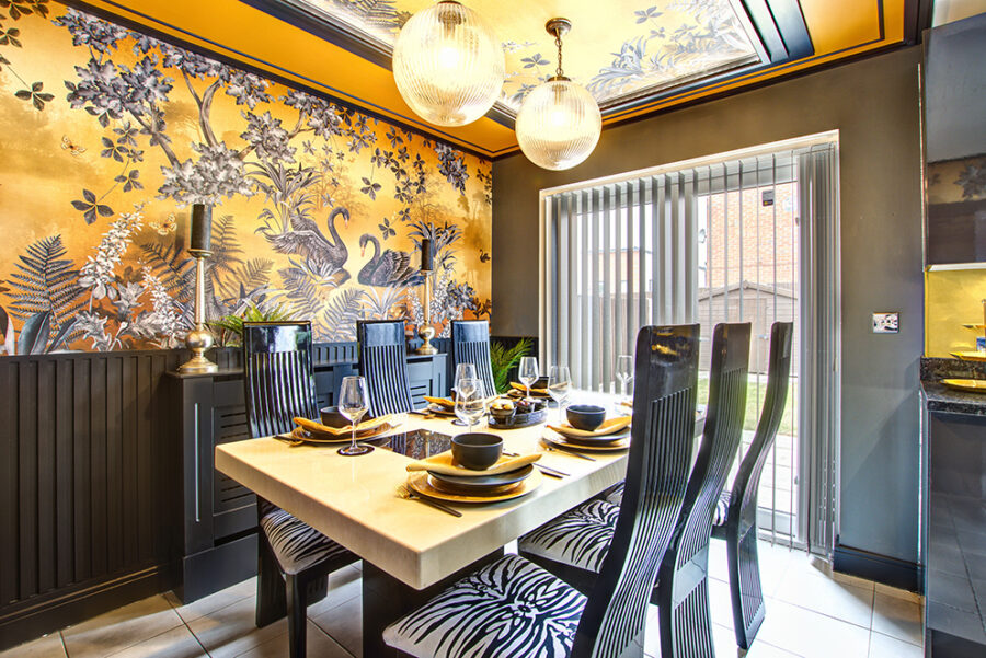
Avalana commented: “My design concept was to create each room with its own unique look and feel, but having some consistency throughout using colour. The first thing I specified was to paint all interior doors and skirtings in an edgy off-black to carry this fluid feel throughout. Even the stairs got the black treatment. I then selected my wallpaper designs for each room which featured black, golds, taupes and silvers. This would give and glamorous feel but in a modern way, perfect for a luxury hotel vibe using a traditional upstairs, downstairs living plan. Some bespoke colour alterations were made to stick to the colour palette but I wanted each room to have its own identity. For example the main bedroom became the bloom room, the second bedroom swan lake and the third blush jungle.
Design Solutions:
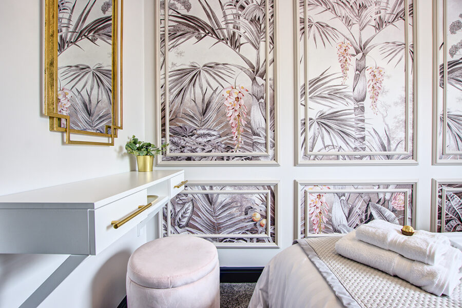
“While each one of these rooms were a blank canvas and relatively new with straight walls and no real obstructions or unconventional shapes, it was a challenge to ensure that the smaller bedroom could accommodate two people to stay and sleep comfortably. A lot more spatial planning had to go into this in order to make a small room look and feel bigger. It also needed to be just as opulent as the main bedroom so it felt harmonious. Careful consideration was needed so for the furnishings to keep to the dimensions of the room. It’s very easy to go safe in a square room but my thought was to use paneling to help create interest. Paneling can also help to blur the harsh lines of a new build property, especially by taking it up and onto the ceiling. Thought was also given to how to present the bed. There wasn’t enough room for a dramatic, full scale headboard or four poster bed frame. However, using a blush toned custom made headboard which ran just underneath the window frame an area for the bed beautifully. This positioning also permitted space for side tables. Precious floor space was maximised by using a floating style dressing table with space for a coordinating blush
pink cushioned stool.”
“The number one consideration from a design point of view was to make as much of an impact as possible on first impression. It had to be visibly stunning and be a space people wanted to be immersed in from the moment they saw it on the internet, to when they stepped through the door. Functionality was key too. Serviced accommodation meant that storage and space were big factors to consider when designing the floor plans and sourcing furniture. Guests would need to feel like it was a home from home as well as a fest for the eyes design wise.”
“In terms of styling, I advised on the types of things I would use for finishing touches and styling. Lots of greenery and oversized vases and lanterns were used to add ambience but given this was a rental and not a home, I paired back the maximalist homewares.”
If you love the look of the above and would like to discuss your project, please contact me on: info@avalanadesign.co.uk


